1300 320 392


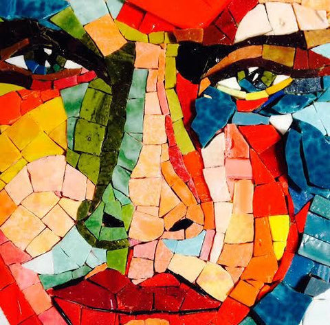
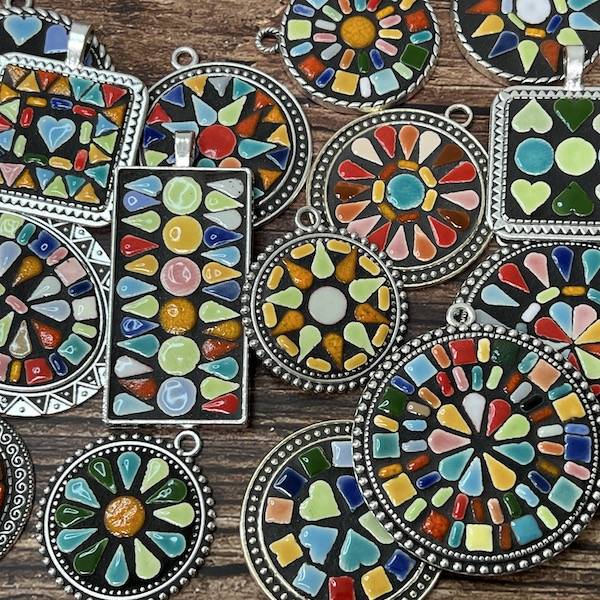
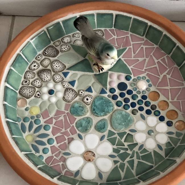
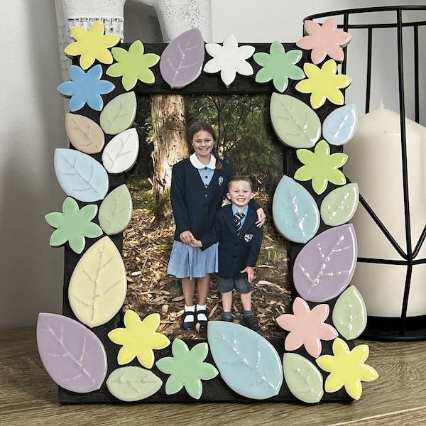
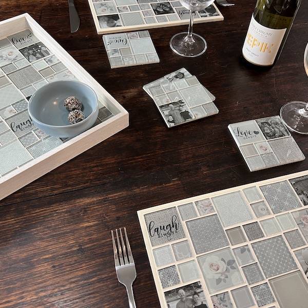
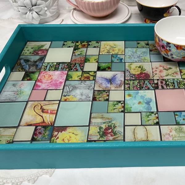
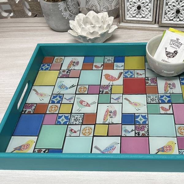
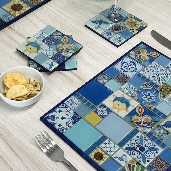
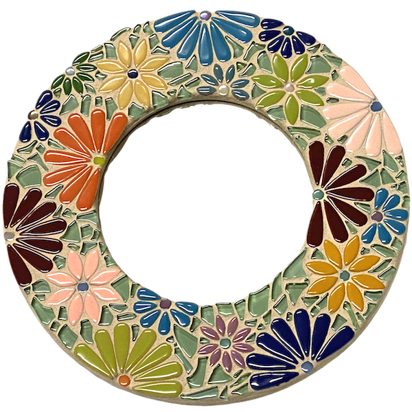
Colour is a critical element in your mosaic design, so having an understanding of some basics can help you achieve the look you are after in mosaics.
Here are some fundamental colour principles that you should keep in mind:
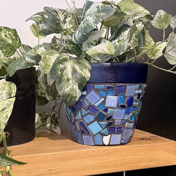
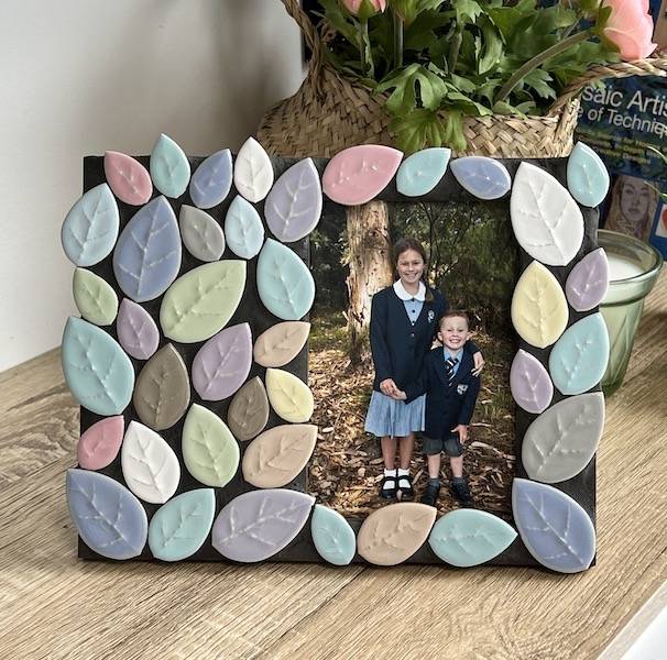
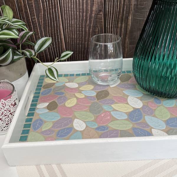
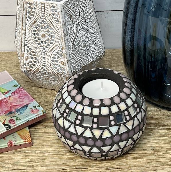
- Distinction between the background and foreground can be created by using soft / pale colours in the background and strong colours in the foreground. Soft pale colours include light pink, light purple, light blue and beige.
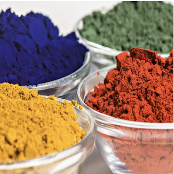
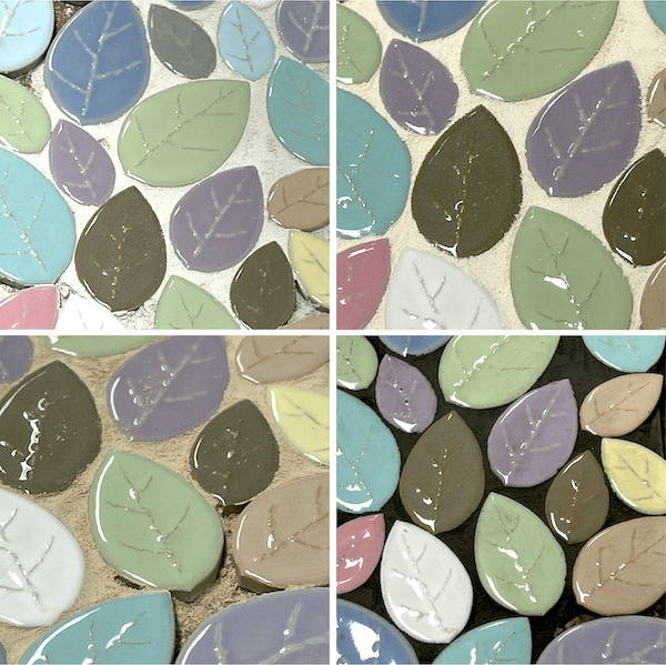
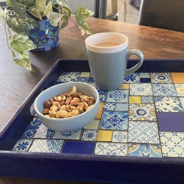
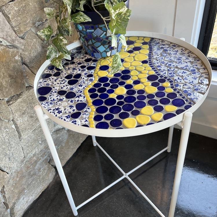
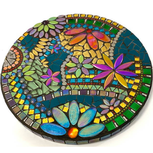
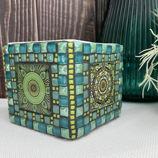
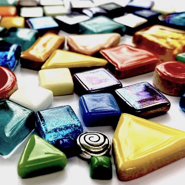
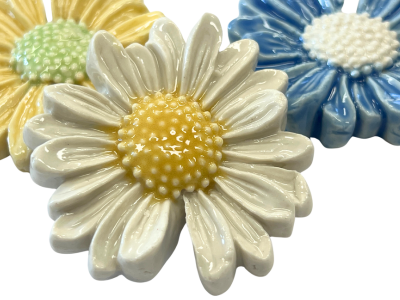
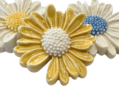
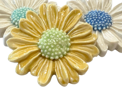
- Unlike painting, the mosaicists color choice is limited by the colours available in their chosen tesserae. To create colour variation different colours are placed next to each other to give the illusion of colour change. For instance, placing small dark green tiles next to small light green tiles will give the illusion of a medium green colour when viewed from a distance.
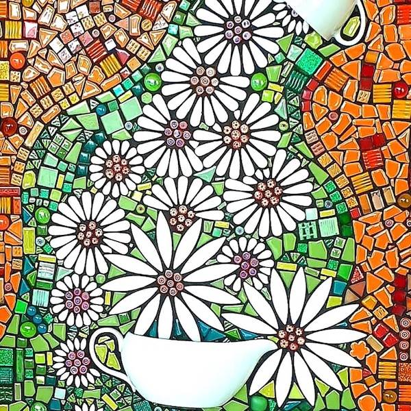
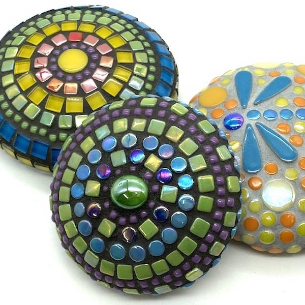
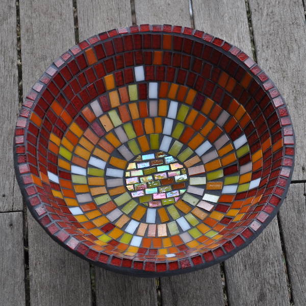
- Warm colours like red, orange and yellow tend to advance towards you and stand out when viewed from a distance. Cool colours, like green and blue, tend to recede and fade into the distance. This can be used to create the illusion of distance, useful when creating a mosaic of a landscape.
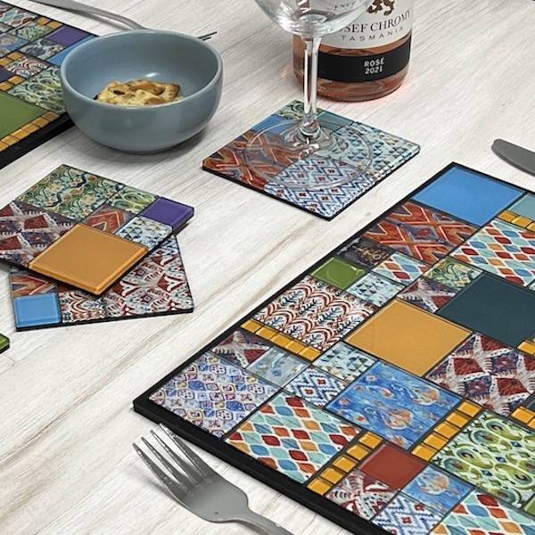
- The intensity of colour changes in relation to the colour that surrounds it.
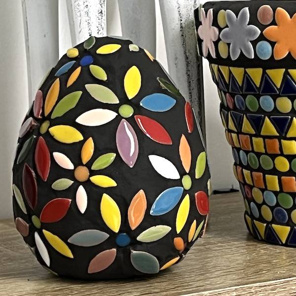
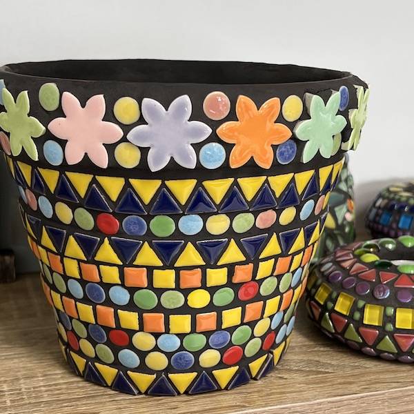
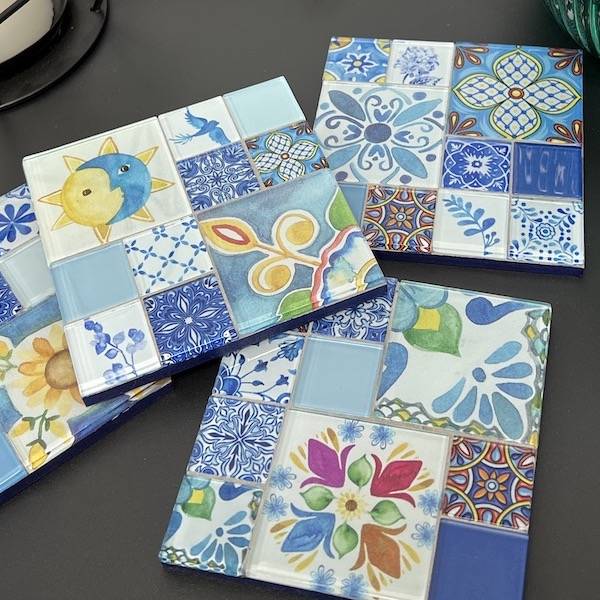
- To achieve harmony in your mosaic the majority of your colours would be adjacent to each other in the colour wheel, for instance red-orange, orange and yellow-orange. Small amounts of contrasting colours could be used by too much contrast would confuse the eyes.
- To achieve contrast choose colours that are directly opposite each other on the colour wheel. For example red and green. Choosing colours that have maximum contrast like this increases their intensity which enhances both the colours. One of the colours will be dominate and the other will enhance it.